
What is the cornerstone of success in business? According to recent PWC research, one answer lies with a strong corporate identity. In a survey of 720 executives, companies that were seen as having a stronger brand identity outperformed those that did not by 25%. The success was based on knowing themselves well enough to leverage distinctive strengths in their corporate identity package to build a clear identity, resulting in the ability to outperform their peers.

Take some of the survey's top-performing brands - Apple, BMW and Coca-Cola. As soon as you mention their names, a distinct logo design springs to mind. Similarly, even in isolation, it's likely that you'd be able to match a font, social media post, or billboard advert to the brands. This is because, through careful planning, brand guidelines and consistent application, these brands have used design to ensure that elements of corporate identity combine to create a strong brand identity that is recognized and remembered by audiences. Whether you’re a small business, startup, or solopreneur, by creating a brand identity this powerful, the success of your organization will soar.
What is corporate identity design?
So what do we mean by 'corporate identity' and what is corporate identity design? And how is that different to branding?
Corporate identity is the visual perception of an entire organization. It differs from branding, which is the complete story of a particular service or product, from the visual elements to the story behind it and its positioning in the market. For example, the corporate identity of the global corporation GlaxoSmithKline is an orange logo bearing the initial 'gsk', and within that corporation are multiple brands with their own visual identity and story, such as Aquafresh and Panadol.
Corporate identity is all the visual elements that are chosen to represent the overall face of your organization - from custom logos to typeface, tagline, imagery, color palette, and tone of voice. It's apparent in physical form too, in stationery, package design, uniforms, signage, merchandise, brochures or online marketing materials. Corporate identity design is the process of creating all these various company visuals and the specific design that goes into them. Although this is not tied to a product or service and the values, corporate design elements are still identifying factors for the organization, and as such must be representative of who the organization is.
If your company's look and feel doesn't reflect how your company acts, there will be a gap between your corporate identity and how you are perceived. This not only weakens your corporate identity, but it also generates mistrust among a confused target audience. When considering a corporate brand identity, or looking to improve yours, there are four basic elements of a brand style guide that must be considered.
Four elements of corporate identity
1. Logo Design
A logo is the most obvious of the graphic elements of corporate identity. As a standout visual signifier, it should act to identify your company instantly. Think about the iconic business branding of Apple's bitten apple, Google's colorful wordmark and Twitter's blue bird and how they all immediately align one visual element with the organization's brand's entire ethos. A strong corporate logo design can even take an organization from being a business to being a cultural icon, such as in the above mentioned cases.
2. Typeface & Fonts
'A picture is worth a thousand words' the saying goes, but an exploration of typography - one of the key elements of corporate identity - will tell you that the style, shape, weight and spacing of the written word can also say an awful lot. That’s true for web content, business cards, email templates, and more. Type can be warm and friendly, elegant and luxurious, or bold and authoritative before you've even read the first word.

Helvetica, a typeface with such significance it is the subject of its own film, was designed by Max Miedinger and Edouard Hoffman in 1957 in an effort to create a utilitarian style that would be clear, bold and legible both across signage and in print. The type was famously used across the New York City Subway and has since become synonymous with the city and adopted by brands including Jeep and American Apparel due to its symbolic appeal as reflecting modern American culture.
The typographic style may be one of the most far-reaching elements of your corporate identity appearing on emails, presentations, contracts, email signatures, brochures, stationery, office signage and more. For this reason, it's vital that the type is an appropriate one for your corporation, whether that's one which suggests stability or modernity, it should be an accurate reflection of who the organization is. Remember that, above all, the type choice needs to be legible, clear, and work across different digital and print platforms.

3. Imagery
As well as words, images are powerful elements of corporate identity. They represent the organization through the consistent feel that the photography and illustrations have.
Having a clear corporate brand identity empowers graphic designers, web developers, photographers, editors, and others on the creative design team to provide high-quality work that aligns with the brand strategy. Additionally, it decreases the need for revisions and lost manpower hours.
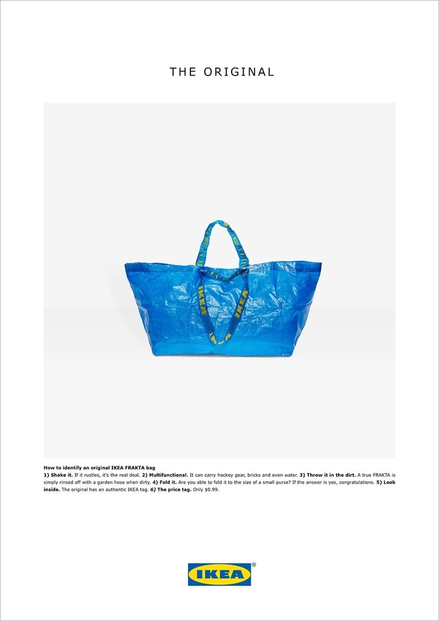
For organizations with a strong corporate identity such as IKEA, clear, consistent and ownable photography has allowed them to differentiate from their competitors and have underpinned some of the most successful and memorable campaigns to date.
Take Acne's recent campaign for IKEA in response to high-fashion house, Balenciaga's bag clone of IKEA's iconic shopper. The image is immediately identifiable as IKEA and pokes fun at Balenciaga's appropriation of IKEA's visual identity:
4. Brand style guides
When you've created all the various elements of your corporate identity, a set of detailed style guidelines are needed to help ensure their successful application. Also known as a corporate identity manual or corporate identity design manual, guidelines ensure the consistent implementation of your brand identity by all individuals.
Guidelines should outline exactly how and when different visual assets (i.e., images, brand colors, typography, logo designs, templates, web designs, etc.) are used so you need to consider all placements - for example, third-party email banners, social media cover images, email signatures, business cards, letterheads. It's always handy to include visual examples of 'Dos and Don'ts' to avoid any misinterpretation of the brand style guide.
Sending your style guidelines enterprise-wide and hoping each of your busy employees reads, understands and applies brand guidelines, however, can be wishful thinking. Templafy is a tool which aids corporate identity implementation by rolling out corporate identity updates across documents, templates, and related visual assets, ensuring new designs are used correctly. Through Templafy Library, employees will always be able to access corporate content that contains the correct visual elements and is in line with all the style guidelines. With greater control over how visual assets are used, your company and employees are able to work together to build the strongest corporate identity possible.